Re-shaping Learning with Sawtooth Benching
A new classroom layout can mean a whole new approach to teaching & learning. ICT teacher Katie reveals how Innova’s sawtooth benching design has transformed learning for her students.

Article written by Katie Rennie, ICT Teacher at Southlands High School

“When it comes to classroom design, any teacher will tell you it’s all about managing the space you’re given and adapting your teaching style to suit the room and your class size.
So of course, the opportunity to completely change your classroom opens up a world of possibility, offering the chance to create a layout that’s easier to control, has better circulation and enables new, more collaborative teaching methods.
“The IT suite I use at Southlands had a very traditional layout.”
PCs were set up on perimeter benching and a bank of desks at the back with 2 rows of 4 computers facing each other. It was a layout that worked, provided I stood at the front of the classroom. The only ‘blind spot’ was 4 desks with screens facing away from me – I’d have to go to the back of the room to make sure pupils really were doing their work!
My classroom was one of several earmarked for refurbishment as part of a large programme of works at the school and the change in design really has impacted on my teaching and on pupils’ concentration levels.
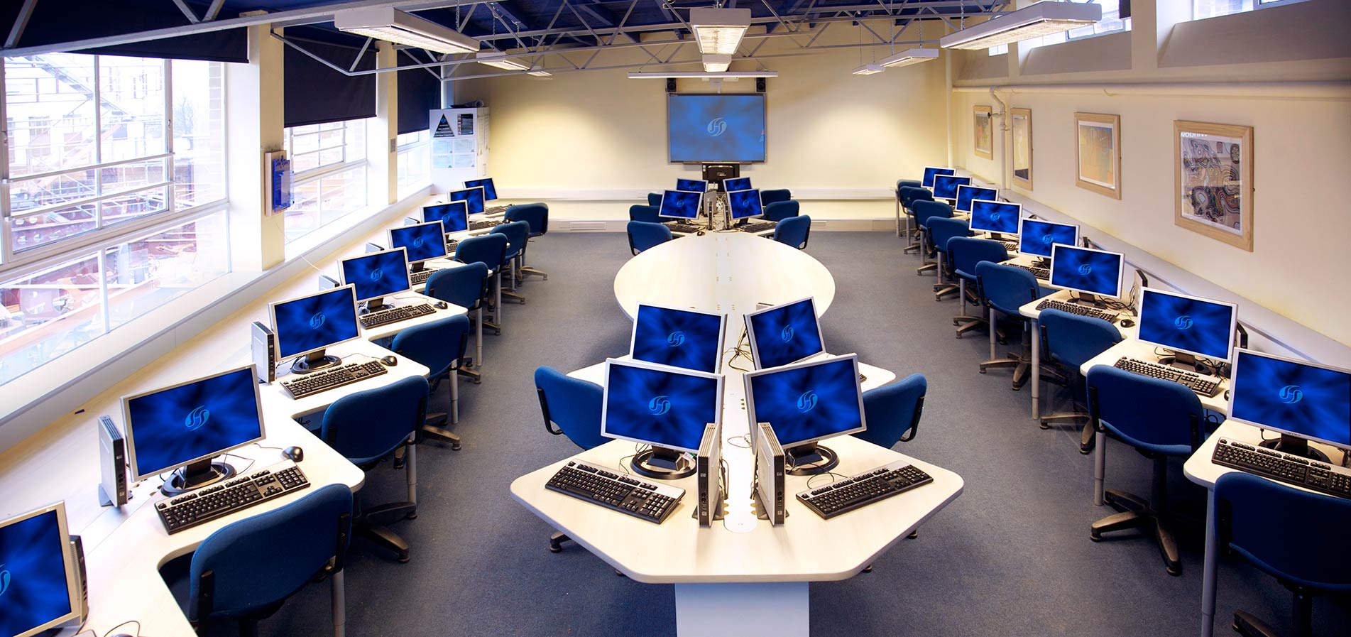
After a lot of discussion about the sort of space that would work best, we opted for a layout incorporating zig zag benching.
One of our key priorities for the IT suite at Southlands was to accommodate more pupils. We also needed a layout which was easy for myself and the pupils to navigate. The existing classroom placed the students side by side, and with computers, bags and books on the tables they were often jostling for elbow room, so increasing the amount of individual space was also on our wish list. We also wanted to create a central area where the class could gather for group work and demonstrations rather than staying seated at their computers throughout lessons. Given that the classroom’s dimensions were going to stay the same, it sounded like a big ask, but the zig zag design has transformed the way the room works.
“The zig-zag design has transformed the way the classroom functions, creating individual workspaces, so there’s enough room for everyone.”
With all the computer monitors now facing the same way, the classroom is much more manageable. I can stand at the back of the class and see the pupils’ screens, so it’s easier to identify if someone is making a mistake and help them. The whole class can progress more quickly, because it’s less likely someone will get left behind, become frustrated and lose focus.
The ‘zig zags’ create individual workspaces, so there’s enough room for everyone. If I need to sit with a student at their desk the design gives me space to do that without getting in anyone’s way.
Building a central group working area into the room has made a huge difference to my teaching style. I can lead demonstrations for small groups of students, they can sit at the tables to use theory books or I can sit at the table while they’re working on their computers and supervise things more closely.
“The pupils’ reaction to the new layout has been overwhelmingly positive.”
They say they prefer this classroom because it feels like a workplace – which is great, because it changes their approach to their work and helps them to take responsibility for their studies rather than relying on being fed information.
They also like the fact they can always be doing something: now they’re all facing the front I can talk them through how to set up a website on the teacher wall and they can do it at the same time, rather than waiting until I’ve talked them through the process.
I’m sure that like me many teachers adapt to the classrooms they have, but having seen how it can transform learning for both staff and students I’d advise anyone about to undergo a refurbishment to grasp the opportunity with both hands.”


